
The answer is yes! The ability to perceive colour and interpret chromatic images plays a key role in our field. Colour is a very powerful visual cue that can be used to disclose information which would otherwise remain hidden if data were visualised only in a black and white fashion; just think of the richness of information in a Colour Blend versus a greyscale attribute display.
However, in order to make the most out of it, it is good to know how our perceptual system works and be aware of the visual effects that can potentially bias our interpretative decision. In fact, we perceive colour in a non-linear fashion as our visual system adopts a number of compensating mechanisms so that we can adapt to different stimuli and visual scenes, resulting in a number of somewhat unexpected visual effects.
One important thing to be aware of is the non-linear sensitivity of our visual system to different parts of the spectrum and our ability to infer apparent structure from variation in colour. On the left of the figure below, the two images have been generated using the same dataset, i.e. a radial pattern decreasing linearly with distance from the centre. When displayed in grey-scale the smooth radial variation is clear; in the colour image a number of steps appear. The image has been created using a colour table where hue varies uniformly, similar in nature to the rainbow or spectrum colour bars found in seismic interpretation software packages.
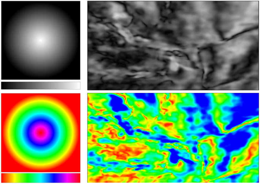
Here the effects of using hue variation to visualise attribute data are clear, as a number of false contours are apparent on the radial profile, most prominently around the yellow and cyan hues. This effect becomes more dangerous when the structure of the data is not known in advance as we risk interpreting these false contours as data features.
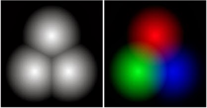
A further effect is apparent in the hue colour bar, where different hues appear more prominent than others (most notable with the green hue) although the colour bar has been constructed uniformly. The same effect is better highlighted below, where an RGB image has been created using three radial profiles mapped to the red, green and blue channels of the image (right). In the resulting image the radial profiles all tend to appear as different sizes, the green being the largest followed by red and finally blue. On the other hand, the same radial profiles viewed with a grey-scale colour bar (left) appear symmetrical and of the same size.
As it is clear from these examples, colour has the potential to affect the interpretation of our seismic data. Therefore during interpretation it is important to maintain an awareness of these visual effects and it is suggested to view data with different colour bars. It is also a good idea to double check what we infer visually against the actual data and numbers contained in our volumes.
Part II