Although GeoTeric provides a wide range of tools to combine different attributes and information, it is not uncommon that interpreters would like to create a volume to either help their understanding or get their message through to peers and management which is not readily available. In this short example we’ll see how Parser and a new colour map can be utilised to achieve such a goal. We will rely on a previous blog post (19 December 2013) with regards to creating a new colour map.
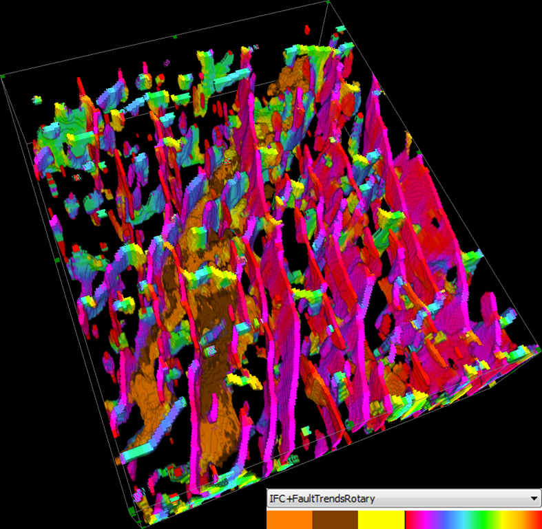
The starting point for the exercise requires two volumes: a Fault Trends and an IFC+, see images below (some of you might find these volumes familiar from our demo video on YouTube).
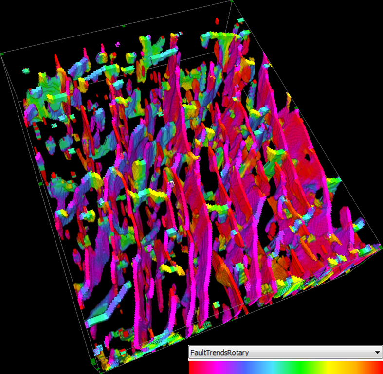
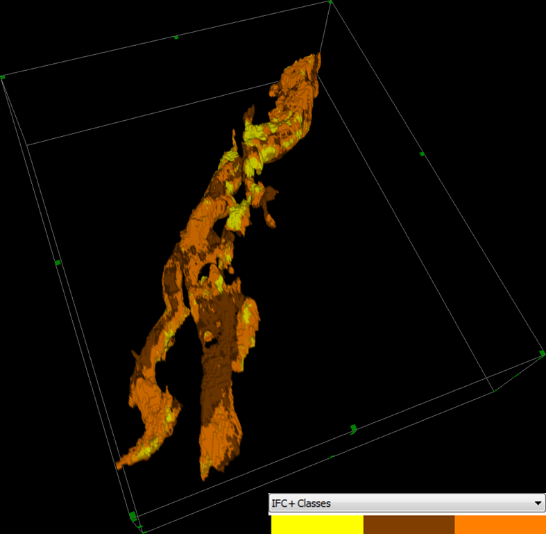
The Fault Trends attribute was calculated with a Thick option and is visualised using the FaulTrendsRotary colour map. The IFC+ volume uses its own internal colour map. Our imaginary interpreter would like to combine the information from these two volumes so that they can analyse the correlation between the detected faults and the distribution of facies or visualise the data draped on a horizon, whilst keeping their original colours.
The first step in the process is the combination of the two volumes, which can be done using Parser. There are only positive numbers and zeroes in both original volumes, therefore the negative domain of the dynamic range is free to use. The following Parser expression assigns the positive numbers to the Fault Trends data, and the negative numbers to the facies. Zeroes represent background in both volumes:
(im2=0)*(-im1) + (im2>0)*im2
where im1 is the IFC+ and im2 is the Fault Trends volume.
The expression instructs the Parser to output the IFC+ value with a negative sign if there’s no fault present and output the Fault Trends value otherwise. The result has both sets of information, but we need to create a new colour map for this specific volume.
The colour maps of the two input volumes are shown in the table below:

The IFC+ colour map defines four discrete colours (black, yellow, orange and brown), while in the Fault Trends colour bar we have a discrete colour (black for the first 0.1 % of the dynamic range) and a range of colours, starting and ending with red.
After these two colour maps are merged, taking into consideration that the sequence of the IFC+ colours has to be flipped to account for the negative sign of the values, we get the new colour map for our combined volume:
Comparison with the original colour maps shows that besides flipping the sequence of the IFC+ colours, the lengths of the ranges are halved, whilst retaining a little interval of black around the zero value. If this colour map is saved into the appropriate sub-folder of the GeoTeric installation folder (one might need Administrator rights to do that), we can use it to visualise our combined IFC+ with Fault Trends volume: