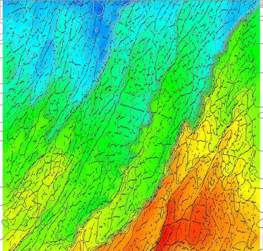
Office walls of exploration teams frequently feature structural-topographic maps of key horizons: topography of the horizon is encoded into colours – usually using a spectrum or a rainbow colour scale – while faults are indicated by e.g. black or red lines. We’ve been recently asked whether such an image could be produced using GeoTeric.
Although GeoTeric offers a wide range of functionalities with horizons, this is not one of the default ones. We can either set Height values in the Viewing Mode roll-down menu, or chose Data mapped and select a Fault Detect volume, but cannot visualise both at the same time. Fortunately, GeoTeric is flexible enough to allow for a workaround, which only requires a horizon and a Fault Detect volume.
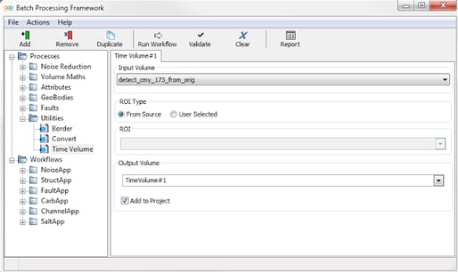
The first step is to create a Time Volume, using Processes & Workflows / Processes / Utilities / Time Volume. The input of the process is the Fault Detect volume (or any other volume of the same size and byte type). For the sake of this blog post let’s call the output TimeVolume#1. This process creates a volume where each voxel has a value that is equal to its two-way travel time or depth.
Figure 1 Use the batch processor to create a time volume.
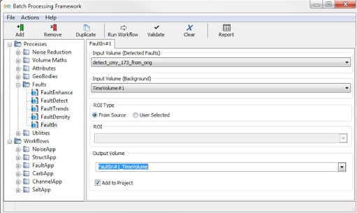
The next step is to embed the detected faults into the TimeVolume, using Processes & Workflows / Processes / Faults / FaultIn. The highest value of the output volume (e.g. FaultIn#1_TimeVolume) represent voxels where there was a fault detected, while all the other voxel values are equal to the TWT/depth.
Figure 2 Embed the detected faults into the Time Volume.
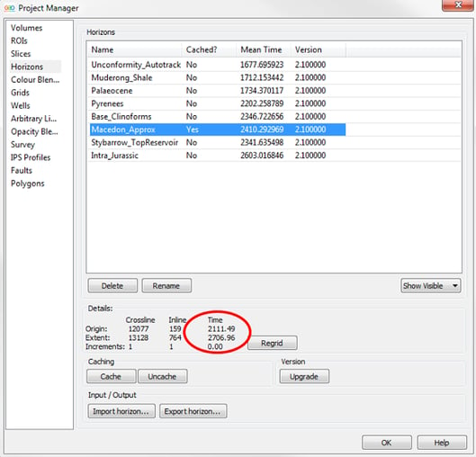
Now have a look at your horizon. In File / Project Manager / Horizons / select the horizon you wish to visualise, and take a note of its time/depth extrema (2111.49 ms and 2706.96 ms in our case). These values will be used to compress the colour scale of the FaultIn#1_TimeVolume.
Figure 3 The Project Manager (hot key: Ctrl+M) is used to establish the extreme of the horizon.
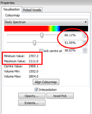
Let’s visualise this volume and select the Body Spectrum colour map. Move the sliders under the colour map and check the numbers next to the Minimum Value and Maximum Value. In this example the top slider was set to 66.11%, the lower one was set to 51.55%, and the Minimum and Maximum Values are 2707.2 and 2111.0, respectively. We are ready to visualise the horizon.
Figure 4 Compress the colourmap so that it reflects the minimum and maximum time/depth values of the horizon.
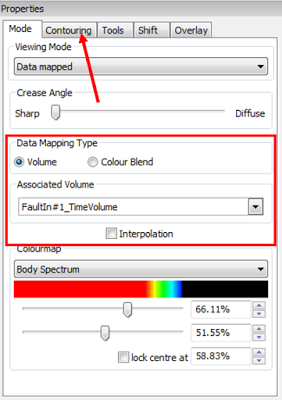
Add the horizon to the scene, select Data mapped for the Viewing Mode, choose Volume for the Data Mapping Type and select the FaultIn#1_TimeVolume. It is worth turning Interpolation off. Contours can be activated under Contouring.
Figure 5 Properties window of the horizon.
Figure 6 Topographic map of the horizon with detected faults (black) and contour lines (grey).
In case you find the fault lines too thin, use Processes & Workflows / Processes / Faults / FaultTrends with the Thick option to produce a new fault volume, and embed it into the TimeVolume instead of the FaultDetect volume. All the other steps are the same, but please note, this can result in a “crowded” image if there are many faults.
(Gaynor Paton and Peter Szafian)
