
When working with color blends of any type, it is best practice to interpret directly in Geoteric to maintain quality and color intensity. As third-party software differs, quality and visualization will often be impacted following blend transfer. However, we do understand there is often a requirement to transfer color blends to Petrel® and therefore we’ve explored how color blends can be visualized and used in Petrel.
In this case, we’ll assume the blend has been transferred using the link option within Geoteric - the most efficient and reliable way of getting your data across to Petrel. For instructions on how to install and use the link, open Geoteric and go to Help >> Index >> Link to Petrel. For a workflow to manually export and import a blend, take a look at this blog post.
The first thing to understand is once you’ve moved your blend into Petrel via the link, is it is NOT a seismic volume. If you open the info tab under the settings for the blend, you’ll see that the data type is listed as Geoteric Colour Blend. You’ll find that the blend looks quite comparable to what you see when you view the same blend in Geoteric, with the exception perhaps any differences in light source, rendering, and other visualization settings that may differ between the two software platforms (Fig. 1). At this point, the blend is essentially a 3D image that can visualize all 16.7 million colors that Geoteric uses.
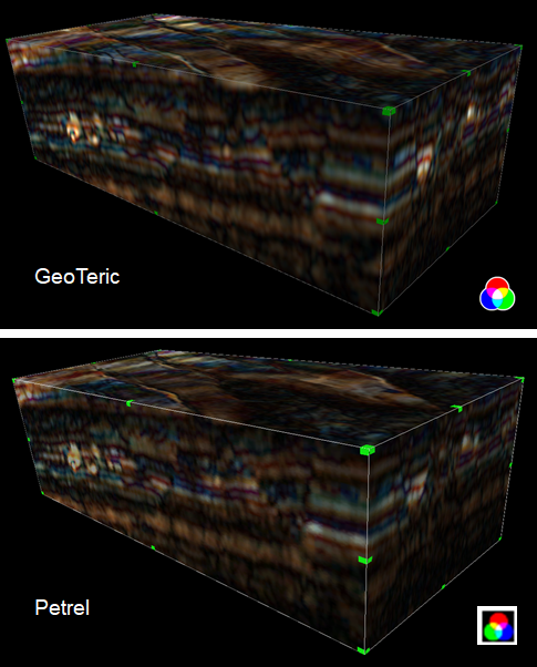
Figure 1 Color blend in Geoteric (above) and its equivalent in Petrel, having been transferred through the Link to Petrel. There are some very subtle differences but overall, they are very similar in appearance.
What can you do with your blend?
Now that it’s in Petrel, you’ll need to know the limitations of manipulating and interpreting it. First off, be aware that the blend and its derivatives can only be viewed in the 3D Window – interpretation and map windows will not display the blend or any element derived from it. Secondly, interpretation on your blend is limited to only faults and polygons. Interpreting horizons or geobodies directly on the blend is not possible.
There are two options for overcoming these limitations. Whilst we prefer the second option, there are undoubtedly occasions where the first is necessary.
Option #1 – Convert the blend into a volume
If you need to work around either of the aforementioned limitations on blend visualization and interpretation in Petrel, you’ll need to convert the color blend into a blend volume. Once this is done, you can interpret on it and visualize it just as you would any other seismic volume in any type of window you wish.
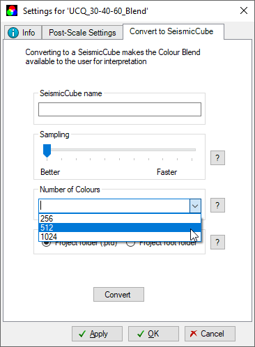 Figure 2: Settings for converting a blend into a seismic cube. Use “better” sampling and 1,024 colors.
To do this, open the settings for the blend (Fig. 2) and choose the Convert to Seismic Cube tab. Give the new cube a name and select a sampling rate for the color conversion. You have a choice between better sampling or faster sampling. We strongly recommend accepting the default setting, which is the former option. Lastly, you’ll choose the number of colors that will be converted into the color bar that will be assigned to the cube. The recommendation here is you use the maximum amount 1,024 as a default so that you can get the best color resolution. It is worth noting in practice, the optimal number of colors may be data dependent. Click the convert button to run the process. To optimize the visualization parameters for the new volume, open its settings and change the interpolation method under the style tab from smooth to none.
It is here where the difference in visualization is clear and is illustrated in Figure 3. We stated above Geoteric uses 16.7 million colors in its blend; 1,024 falls short of that by several orders of magnitude. The result is a blend volume that lacks richness in color and can appear to be pixelated. The panels in Figure 3b-d show the same time slice through each of the three options for blend volumes along with the corresponding time slice from the blend itself in Figure 3a. The arrows in the figure point to areas where changes between each image can be seen. Upon inspection, it’s clear that the blend in Fig. 3a does the best job. Again, the degree to which a blend volume clearly images the features in question will come down to what those features are, what type of blend it is, and what volumes compose that blend (i.e. what colors make up the blend).
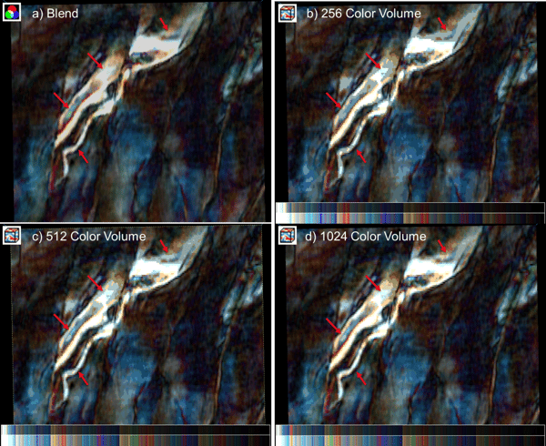
Figure 3: Time slices through a) the color blend itself, b) a 256 color volume, c) a 512 color volume, and d) a 1,024 color volume. Each volume shows the corresponding color bar in a true version and an artificially brightened version for comparison. Note the arrows pointing out regions where clear differences can be seen. The 1,024 color volume option is the best blend conversion, but it still falls short when compared back to the blend itself.
Option #2: Leave the blend as-is
The second option is the preferred method if you’re willing to view and interpret your blend in the 3D window. By right clicking on the blend, you can insert an inline, crossline, or z-slice which can be used to interpret faults or polygons. Additionally, you can map the blend to a surface using the insert horizon mapping option (Fig.4). After choosing this option a new object labelled <no horizon selected> will appear under the blend. Open the settings for this object and use the properties tab to select the desired surface.
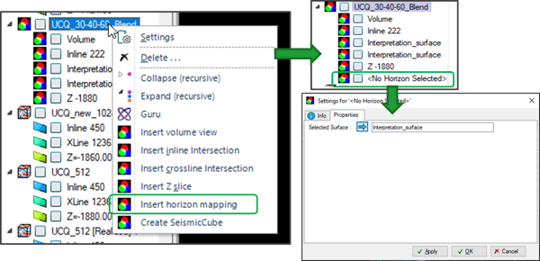 Figure 4: Steps to map a blend to a surface in Petrel.
The benefit of this can be seen immediately in Figure 5, which compares a surface mapped from a blend to a surface mapped from a blend volume using 1,024 colors. The former does a good job of showing features along the horizon while the latter obscures several features to a point where they become hard to recognize.
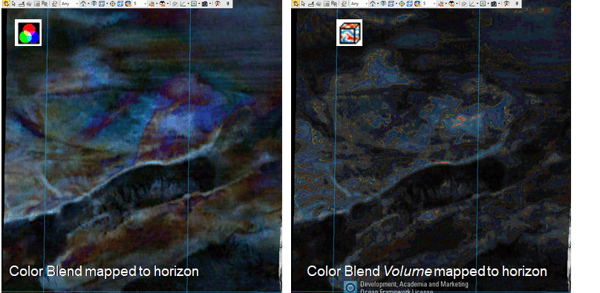 Figure 5: Horizon extraction on a color blend (left) vs. a blend volume (right).
Discussion
If you are to transfer your blend into Petrel, from the examples shown above, leaving the color blend as it is once it comes across from Geoteric is the best way to visualize the volume. But what about interpreting it? We close with the following points:
- You can’t interpret horizons on a color blend in Petrel, but should you need to do this at all? A Frequency Decomposition RGB blend will likely lack the resolution to interpret horizons in inline or crossline orientation. In this case, the blend should be used to reveal where you may want to interpret horizons on your seismic reflectivity data.
- Faults can be interpreted on inline, crossline, or time slices through RGB or CMY blends.
- Depositional environment mapping can be carried out by interpreting polygons on horizon maps or time slices through the blend.
- If you prefer interpreting in 2D, toggle into orthographic camera mode and view the slice or surface directly using the camera orientation button.
- If you need to view the blend in map, interpretation, or any other windows convert it to a 1,024 color blend volume. You can always interpret on the blend itself in the 3D window and visualize the interpretations along with the blend volume elsewhere.
As we mentioned at the beginning, blends in any orientation, shape, or form will always look best in Geoteric. Adaptive Horizons, Faults, and Geobodies as well as polygons can be interpreted on blends and surfaces in 2D or 3D. These products can always be sent to Petrel or other platforms by way of the links or via export.
Petrel® is a mark of Schlumberger