
Peak Frequency and Peak Frequency Magnitude Volumes
Introduction
In this 2-part post, a workflow is described on how to create and visualize Peak Frequency and Peak Frequency by Magnitude volumes. This workflow provides an enhanced visualization of spectral differences over different lithology and can be used as a seismic facies classification tool, based on dominant frequency. The Discrete Frequency volumes can be generated in the Frequency Decomposition tool using either Constant Q, Constant Bandwidth or the High Definition Frequency Decomposition within GeoTeric.
Generating Peak Frequency volumes, using discrete frequencies, allows for delineating subtle depositional and structural patterns in a manner similar to RGB blending of Frequency Decomposition volumes. While RGB blend is limited to 3 input volumes, the Peak Frequency volume can use as many discrete frequencies as desired allowing better coverage of the spectrum and mapping of subtle frequency variations.
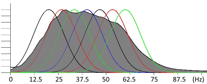
Figure 1 - Peak Frequency workflow allows to achieve maximum coverage of the spectrum by discrete frequency bands.
The resulting volume maps, shows for each voxel, the dominant frequency (frequency with the maximum amplitude). This provides better understanding of the reservoir heterogeneity as frequencies can be correlated with thickness and lithology.
Interpretation of Peak Frequency Volumes
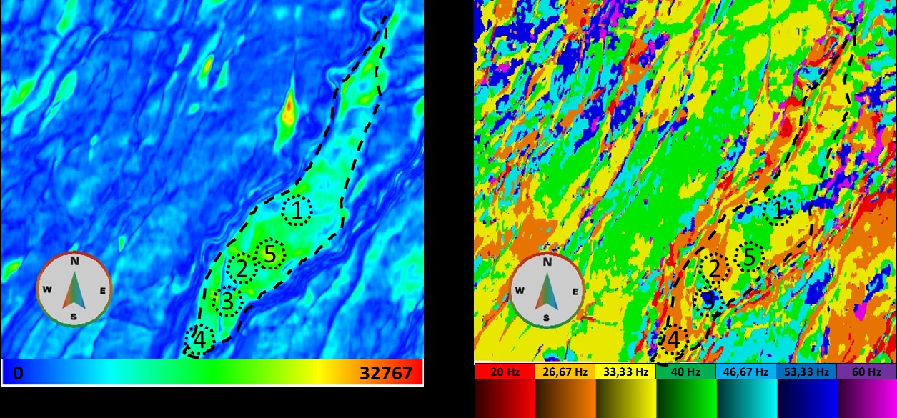
Figure 2 - Comparison between Envelope (left) and Peak Frequency Volume (right).
The resulting Peak Frequency volume is shown on the right in Figure 2, compared with the Envelope volume on the left. One of the main characteristics extracted from Frequency Decomposition volumes, is the correlation between bed thickness and frequency (Partyka et al., 1999; Khonde and Rasogi, 2013).
Therefore, a Peak Frequency volume can be interpreted as an estimation of the reservoir thickness. In the Stybarrow reservoir, it is known that, lower frequencies correspond to thicker sands, while higher frequencies correspond to the erosional shale filled channels. As can be seen in the Peak Frequency volume, reservoir heterogeneity is controlled by erosional channels (1 and 3), and faults blocks (2 and 4). The bright spot (5) seen on the envelope can be explained by constructive interference, while best reservoir properties (thickness and lithology) are found at locations 2 and 4 characterized by lower frequencies.
Those results can be validated by published inversion results O’Halloran G., et al., 2008 and Glinsky et al., 2005; and 4D monitoring interpretation – Duncan et al., 2013.
In Part 1 of the post, it is demonstrated how to generate and choose discrete frequencies, create a Peak Frequency volume and generate the corresponding 1D colour bar for optimal visualization. Part 2 will demonstrate how to create a Peak Frequency by Magnitude volumes.
Part -1 - Peak Frequency Volume
Discrete Frequency volumes
It is recommended to perform noise attenuation and spectral balancing before generating the discrete frequency volumes. Spectral balancing accounts for the loss of energy of higher frequencies generating a flatter spectrum.
It is possible to generate using any of the frequency decomposition tools available within GeoTeric. The discrete frequency magnitude volumes can be generated from Constant Bandwidth and Constant Q Frequency Decomposition tool under the Normal Preview selection. On the Data Preview tab it is possible to select the discrete frequency volumes of interest by marking the adjacent boxes. Give the volumes a name and it will be followed by the data selected.
Note: Frequency Decomposition tool in GeoTeric provides an option to generate Mode and Mean frequency volumes. Those volumes provide continuous frequency readings. While our interest in generating a volume with discrete values for facies classification and magnitude modulation.
High Definition Frequency Decomposition
To generate discrete frequency volumes using HDFD go to Stratigraphic -> HDFD and Select the spectrally balanced volumes as input. Select central frequencies and press Generate 3D blend. To generate more than three volumes choose different frequencies and repeat this step until the desired number of discrete frequencies is achieved. It is recommended to keep even spacing between central frequencies. For example: 20-30-40-50-60 Hz.
Peak Frequency Volume
With the discrete frequency volumes scaled, open Workflows ->Batch Processing Framework->Processes->Volume Maths ->Parser.
Under expression type a conditional expression that will assign the central frequency to the voxels were the corresponding volume has the maximum magnitude. In this case we have 7 discrete frequency volumes:
(im1>im2 & im1>im3 & im1>im4 & im1>im5 & im1>im6 & im1>im7)*2000 +
(im2>im1 & im2>im3 & im2>im4 & im2>im5 & im2>im6 & im2>im7)*2667 +
(im3>im1 & im3>im2 & im3>im4 & im3>im5 & im3>im6 & im3>im7)*3333 +
(im4>im1 & im4>im2 & im4>im3 & im4>im5 & im4>im6 & im4>im7)*4000 +
(im5>im1 & im5>im2 & im5>im3 & im5>im4 & im5>im6 & im5>im7)*4667 +
(im6>im1 & im6>im2 & im6>im3 & im6>im4 & im6>im5 & im6>im7)*5333 +
(im7>im1 & im7>im2 & im7>im3 & im7>im4 & im7>im5 & im7>im6)*6000
The value after * represents the central frequency, multiplied by 100, to convert Hz value to integers that would fit the bit rate of the volume (in this case 16bit). The ranges are selected to maximize the interval assigned to each frequency. Example – 33,33 Hz * 100 = 3333.
Give the output volume a name and press Run Workflow to generate the volume.
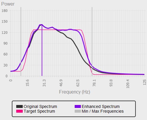
Below, the peak frequencies are displayed on a horizon, using an inverted Spectrum colour map. The colour map is inverted to have red corresponding to low frequency and blue to higher. However to we need a discrete colour map to properly visualise the peak frequencies.
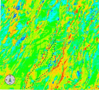
Figure 4 – Discrete frequency volume displayed using Spectrum colour map.
Create New Colour map
Please follow the link http://blog.geoteric.com/2013/12/create-new-geoteric-colour-maps.html to view the complete information on creating new colour map in GeoTeric. Here a brief case will be illustrated to create a colour map that will be used for Peak Frequency and Peak Frequency by Magnitude volumes. This colour map uses hue to represent the Peak Frequency and saturation to represent its magnitude. A text editor will be needed for part of this process.
![]()
Figure 5 – 2D colour map for Frequence (Hue) and Amplitude (Lightness).
In GeoTericwe need to convert this 2D colour map to a linear (1D), where discrete intervals described by the hue will represent a frequency and the changes in saturation along this interval will represent magnitude. To do this we need to select colours to represent the frequency and define a saturation interval.
It is better illustrated with the example below:
For the central frequency volumes created in the previous step we define the following intervals.
Table 1 – Central Frequency and Interval Values
|
Frequency
|
20 Hz
|
26,67 Hz
|
33,33 Hz
|
40 Hz
|
46,67 Hz
|
53,33 Hz
|
60 Hz
|
|
Min value
|
1333
|
2001
|
2668
|
3334
|
4001
|
4668
|
5334
|
|
Max value
|
2000
|
2667
|
3333
|
4000
|
4667
|
5333
|
6000
|
Theoretically intervals are chosen to maximize the range assigned to each frequency. In this case the volume corresponding to 33,33 Hz will be mapped to the range from 2667 to 3333. This interval will be used for modulation by amplitude as shown ahead.
Here smaller magnitudes will start at the “Min value” for each interval and maximum amplitudes at the “Max value” for each interval:
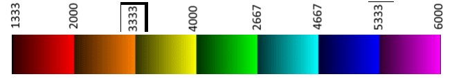
Figure 6 – Conversion of the 2D colour map shown in Figure 3 to 1D. Similar colour maps are used for DizAzi Combine and volume Combo workflows.
For this step a simpler colour map could be created that assigns a single colour for each interval. However we will need the colour modulation for the next steps and creating one single colour map rather than two can save some time.
In order to create the colour map we need to convert the interval for each frequency from values to percentages. The volume generated in the previous step has a data range from 0 to 8191. The values below 1333 and above 6000 will set to black because they do not have corresponding frequency volumes and will have no values in the histogram as will be shown below. Also it is important to consider the colour map binning, a color map has 9-bits (512 bins), and therefore to correct values, the min and max ranges should be limited by nearest bins. This assures that in each interval, the min and max value falls in the corresponding colour bin.
Table 2 - Values Ranges
|
Hz
|
2000
|
2667
|
3333
|
4000
|
4667
|
5333
|
6000
|
||
|
Min
|
0
|
1345
|
2017
|
2673
|
3345
|
4017
|
4673
|
5345
|
6017
|
|
Max
|
1344
|
2016
|
2672
|
3344
|
4016
|
4672
|
5344
|
6016
|
8192
|
|
Range
|
1344
|
671
|
655
|
671
|
671
|
655
|
671
|
671
|
2175
|
|
%
|
16.41
|
8.19
|
8.00
|
8.19
|
8.19
|
8.00
|
8.19
|
8.19
|
26.55
|
This is an extraction from the colour map file created:
Table 3 – Colour map file script
|
<colourmap name="PeakFreq Amplitude (7 volumes)">
|
Name that is displayed in GeoTeric
|
|
<!--(1)-->#BLACK
<range width="16.41">
<point>
0.0 0.0 0.0
</point>
<point>
0.0 0.0 0.0
</point>
</range>
|
First block covering the smallest values. – 0 to 1332 - Black
Range in percentage
Start color – Red Green Blue – 0=minimum saturation 1=maximum saturation.
End color – Red Gree Blue.
|
|
<!--(2)--> #RED
<range width="8.19%">
<point>
0.2 0.0 0.0
</point>
<point>
1.0 0.0 0.0
</point>
</range>
|
Second block – 1333 to 2000 – Red
Range in percentage
Start color – Red Green Blue – 0=minimum saturation 1=maximum saturation.
End color – Red Gree Blue.
|
|
…
|
Subsequent ranges
|
|
</colourmap>
|
Close color map
|
The final colour bar has the following design:
Figure 7- Resulting colour map. To account for values range of the Peak Frequency volume black interval are added.
And when applied to the volume has the following histogram for the example volume:
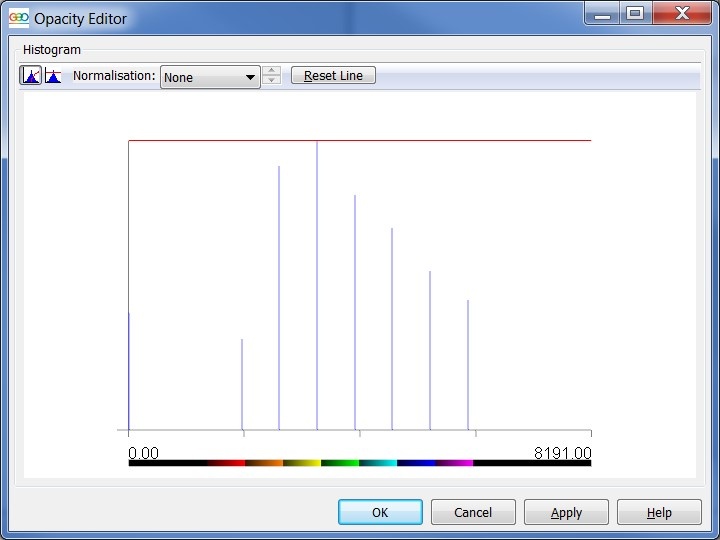
Figure 8 - Histogram of Peak Frequency Volume
The horizon with the peak frequencies displayed with the new colour map.
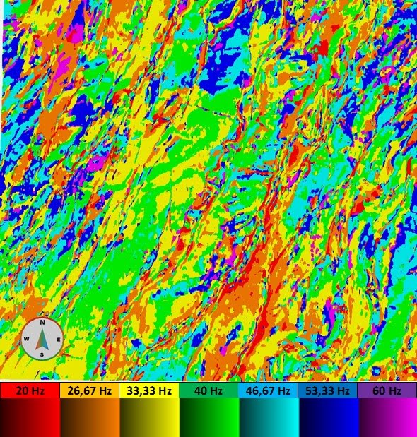
Figure 9 - Peak Frequency Volume with the corresponding colour bar
The weak contrast between reservoir internal and external area can be explained as having similar bed thickness distribution. Adding magnitude modulation to the Peak Frequency, facilitated its interpretation and adds information on amplitude variations within each peak frequency. This will be addressed in the next blog post.
(By Pavel Jilinski)